How to Make a Gantt Chart in Excel


Gantt charts are a useful tool for visualizing timelines and task dependencies when managing projects. Microsoft Excel, widely used and user-friendly, allows you to create Gantt charts and enhance your project management abilities. This guide will teach you how to set up and customize your Excel Gantt chart template from start to finish.
Overview of Gantt Charts
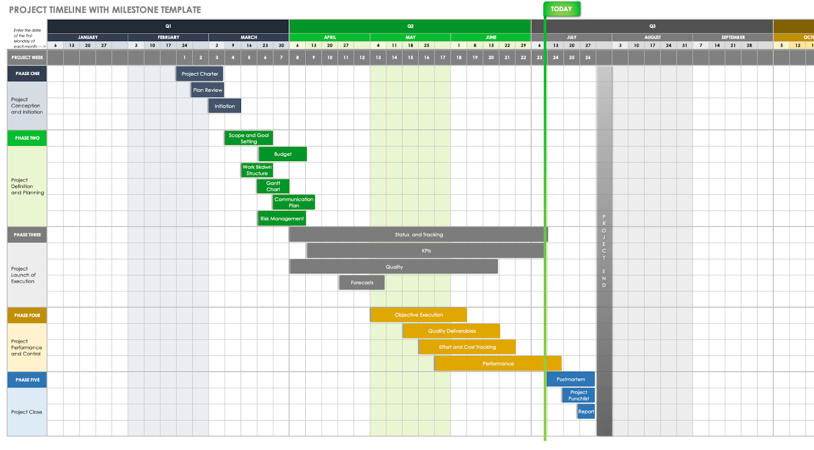
In essence, you’re making a Gantt chart for your spreadsheet, which means you’ll have some thinking to do on how to present the information. Create a grid with columns for the task names, start dates, durations, and end dates. Project-specifics columns should also be included. This includes data such as resources, task dependencies, and status. You want the layout to be very easy to use for you to input and maintain the data. The way you format it is important; use headings to break it into sections and varied colors for tasks, phases, and priorities. The logic behind this is that it is easier for someone to absorb visual distinctions, which means your stakeholders will be able to quickly understand where each responsibility lies and not get muddled.
Upgrade Your Workflow With A Cutting-Edge Task Management
Save time and effort—try Bitrix24's free visual Gantt Chart Maker with dependencies today. Enhance your project planning with modern & intuitive online tools.
Try NowBenefits of Gantt Charts in Project Management
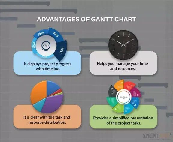
Gantt charts help in project visibility among other ways. These Gantt charts equip team members to understand the scope of a project, its project schedule, and their responsibilities. The project schedule reveals bottlenecks and overlaps offering team leaders a chance to move resources where they are needed and try to meet the inevitable deadline as cost-effective. Milestone deadlines can be tracked by project managers when they make a Gantt chart; or edit and upload it to let shareholders know what is going on in real time between projects that change their nature.
Why Excel Is the Right Tool for Gantt Charts

Gantt charts are easy to make with Microsoft Word and the Excel software suite because of its wide range of different functions. All of the grid layout, maths and even design: With a wealth formula calculations, Excel tool enables to produce Gantt charts that any project members can view easily. Although Excel gives one more opening off flexibility than does this static project model, albeit not comprehensive project management on its own for Gantt charts. Excel has formulas to calculate tasks' durations and task dependencies pairwise, and with conditional formatting at least it shows the way in which such dependent pairs are doing. Excel links to Microsoft Excel Project will make it perfect for working on complex projects. Reallocating specialist software functions internally can keep pesky costs down for Microsoft Word supporters.
Getting Started with Excel
Comprehensive mastering of the basics of Excel and arrangement of its interface is a requisite for getting things started with work on the online Gantt chart maker. This section is concerned with introducing the interface of Excel then setting the environment.
Prerequisites: What Do You Need Before Starting?
To work with an Excel Gantt chart, what do you need? You need Gantt chart tools and data, that is all. To enhance performance and security, you will improve the Microsoft Word Excel installation.
Understanding project timeline intricacies is crucial, encompassing task specifics, commencement and conclusion dates, durations, task dependencies, and resource allocation. Proficiency in generating Gantt charts, formatting cells, and executing basic calculations within Excel serves as a prerequisite for employing this indispensable tool. For novice Microsoft Word users, exploring instructional resources or Gantt Chart examples can expedite the mastery process. Before starting to create or customize a Gantt chart in Excel, lay the groundwork. Know its design and architecture first.
Understanding Excel’s Interface
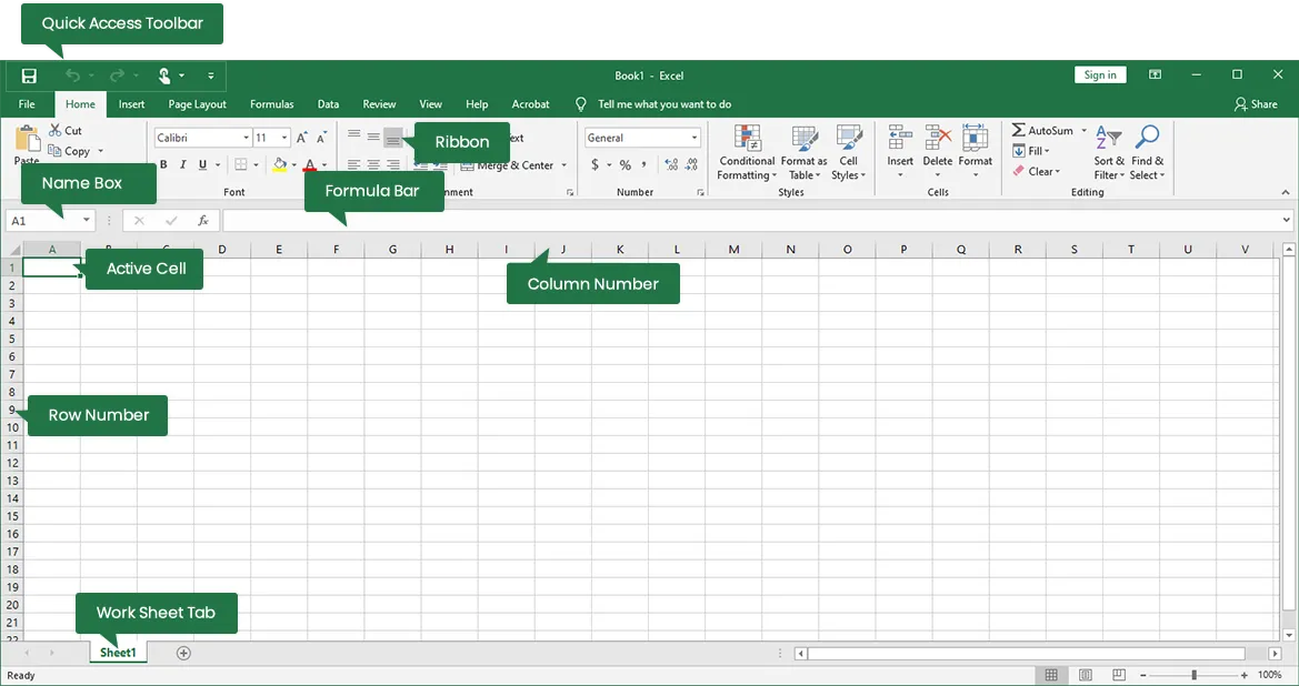
Even project managers must get over the original Excel user interface. The top ribbon bar chart provides you with tools to develop and control charts and get access to other Gantt chart templates.
Setting Up Your Excel Environment
Excel table setup is critical to the productivity of the Excel Gantt chart. The layout of your workbook, an Excel table with columns for the tasks, task dependency titles, start and completion dates, and the task’s duration in this organization, remain your chart forever during the project. A quick access toolbar should have shortcuts for your formatting and chart manipulations. Customizing the ribbon with extra tabs or commands helps in saving the chart the effort and time. A personal excel table helps save time and create an effective project to manage the Gantt chart templates during the project.
Planning Your Gantt Chart
Before entering Excel, proper preparation is essential. For a Gantt chart to be effective, it should correspond with both the project scope and its relevance. An Excel spreadsheet needs to include your milestones and deliverables, time and expense carryovers for each month of the year-based on the project scope itself; specific unit(s) that resource is attached to time spent on and so forth as well as dependencies among tasks.
Define the Scope Of Your Project
The first and most important part of making a Gantt chart is to define the project and what you want it to achieve. The project scope breaks down the project objectives, project deliverables, project resources constraints. All the project deliverables must be clearly stipulated in the project and description. The scope should entail some module activities that can be measured and quantified. Lastly, give the project managers the human and the material resources and the duration of the project. The scope available before you start making the Gantt chart helps make a chart that project schedule works accordingly and aligns the Gantt chart with project goals and position.
Identifying Key Milestones and Tasks
A milestone, on the other hand, is a critical phase and the main activity. They can be named after the events and the progress of the project. Every milestone has a criterion to determine its status and task. In addition, milestones define the monitoring and coordination of the Excel Gantt chart.
Estimating Task Durations
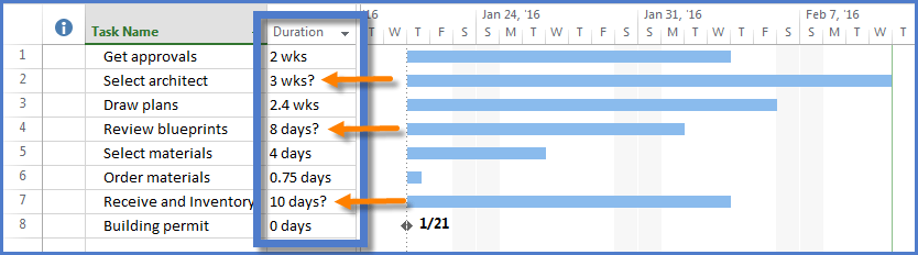
Creating precise timelines for Gantt charts necessitates accurate assessments of task duration. Effective communication with team members responsible for tasks is crucial. Over time, experience will enhance the ability to estimate time requirements for various job components. Additionally, it is essential to consider factors such as resource availability, potential bottlenecks, and external dependencies, as they can impact the time required to complete a task. Furthermore, estimating comparable projects can provide an appropriate level of estimation by utilizing prior data related to similar tasks.
Assigning Resources and Dependencies
For the best construction project, assign resources and map dependencies. Talent, availability, and project needs affect resource allocation. Staff, resources, and technology should be assigned. Assigning duties to project team members to ensure accountability conserves resources. Job dependencies should reflect project sequencing. Dependencies indicate which jobs must wait for others to complete, providing a coherent project stream. Managing these variables makes your Gantt chart current and straightforward.
Initial Setup in Excel
When beginning your Excel document, the Gantt chart may be simplified. The creation of a new workbook, positioning worksheets, and entry of main project data for Gantt charts are included in this section.
Creating a New Excel Workbook
The start of a new Excel chart is the best approach to creating a Gantt chart. This specialized area would be used to store project information and identify the publications. The workbook will be labeled with the project name and dates. The detailed task list, resource selection, and Gantt chart will be held in separate pages on the workbook. This arrangement will aid in the organization of data.
Setting Up Your Worksheet Layout
Try to imagine how you want to see your data in the spreadsheet. You will need an essential grid featuring columns for the task title, start date, duration, and finish date. If you need to provide more project information, consider adding columns for its resources, dependencies, and status. The layout should be logical and easy for you to input and adjust the information. Proper formatting is important: divide the parts with a bolded header and use different colors or styles for your project tasks, stages, and priorities. A visual distinction helps people instantly grasp the chart’s content and issues, reduces the room for ambiguity, and enhances communication.
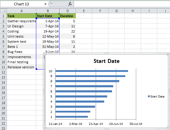
Entering Basic Project Data (Tasks and Dates)
Now you have a new spreadsheet, and you need to fill it with all the data about your project. Each task should have a separate row with its start and finish dates and any additional information, such as the nature of its resources or dependencies. This data will be the basis of your Gantt chart, so it has to be accurate to avoid complications in chart-building. You may also use this sheet to calculate the project tasks durations and finish dates by putting formulas to this effect. Automation saves your time and reduces human errors in date calculations when your project’s timelines shift. Using this information, you can plan the timeline down to every task.
Building the Gantt Chart

When your Excel sheet is filled with the project’s data, you can start building your Gantt chart. This section will describe how to insert a stacked bar chart, set the data range, and adjust colors, labels, and data types.
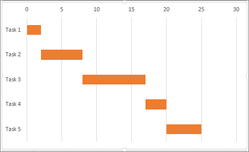
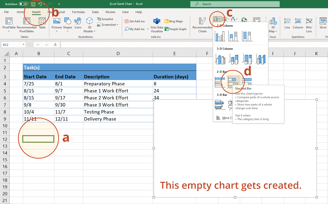
Inserting a Stacked Bar Chart
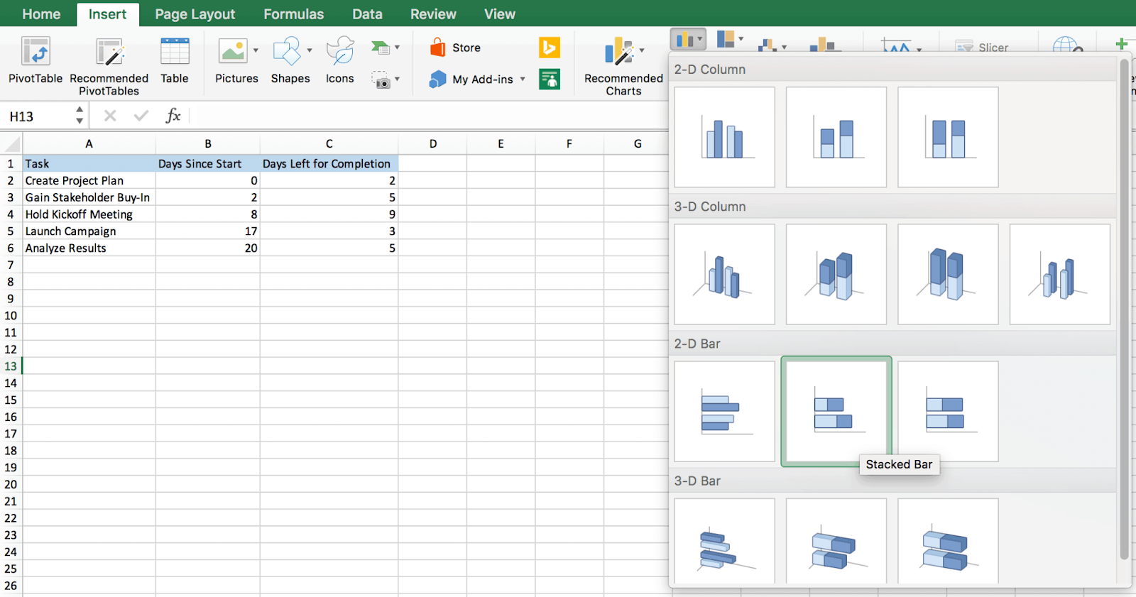
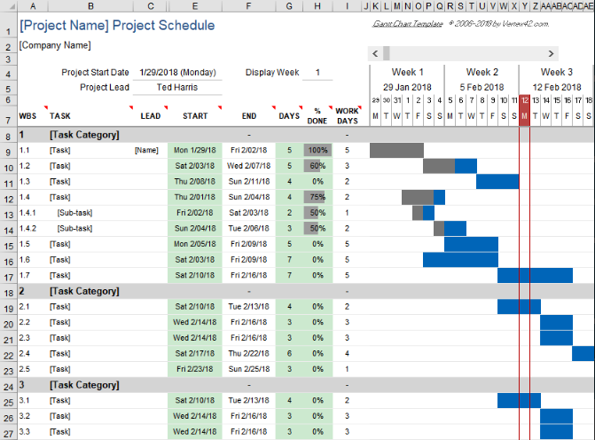
This visual Gantt chart is created by inserting a stacked bar chart through Excel’s chart function. Select a data range with task titles, start dates, and durations. Then go to the Insert tab, click stacked bar chart. This stacked bar chart represents each task through a bar chart across a timeline, the length indicating the task’s duration, and the stacking shows the order of the project tasks.
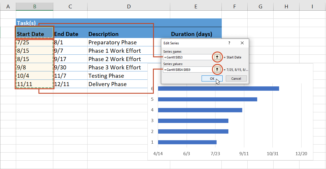
Configuring Your Chart Data Range
You should adjust the stacked bar chart data range to include all your projects. You may need to adjust the range from all your projects to one phase of the project or add more tasks. The range should be properly arranged to suit your Powerpoint Gantt chart to represent the entire project works and timeline to guide you in tracking your and making necessary adjustments.
Adjusting the Bar Colors to Represent Different Tasks
Change the colors of the task bars on your Gantt chart. You should color jobs and phases to enable team members to understand well and the chart to look beautiful. Changes in color help members to see their jobs and understand the entire project phase without going into each detail. Change the bar chart colors manually or by task status or types using excel formatting tools.
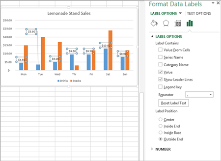
Adding Task Names to the Chart
Write the names of project tasks on the task bars. You can add data labels to the chart. You can select your chart, and on the ribbon, you can click on Chart Tools, Layout, and choose Data Labels. You can use the Inside End to locate the labels at the end of each bar chart to make a Gantt chart clear. Adjust the size and change the color of the label fonts to make a Gantt chart identifiable against their task bars.
Modifying Date Formats on the X-axis
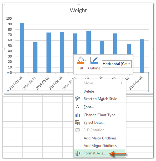
Change the X-axis labels to fit the date format, depending on your project. Then by right-clicking on the X-axis and choosing axis, the user might then select the date based on the timeliness of the project. It will be days, weeks, or months depending on the nature of the job. Hence, the dates should be properly formatted to fit the project timeline for all stakeholders to see the progress.
Enhancing Chart Readability
After developing your Gantt chart, improve its legibility to convey project specifics. Setting stacked bar chart width and spacing, labeling tasks, customizing the chart's color scheme, and using conditional formatting to indicate task status are covered in this section.
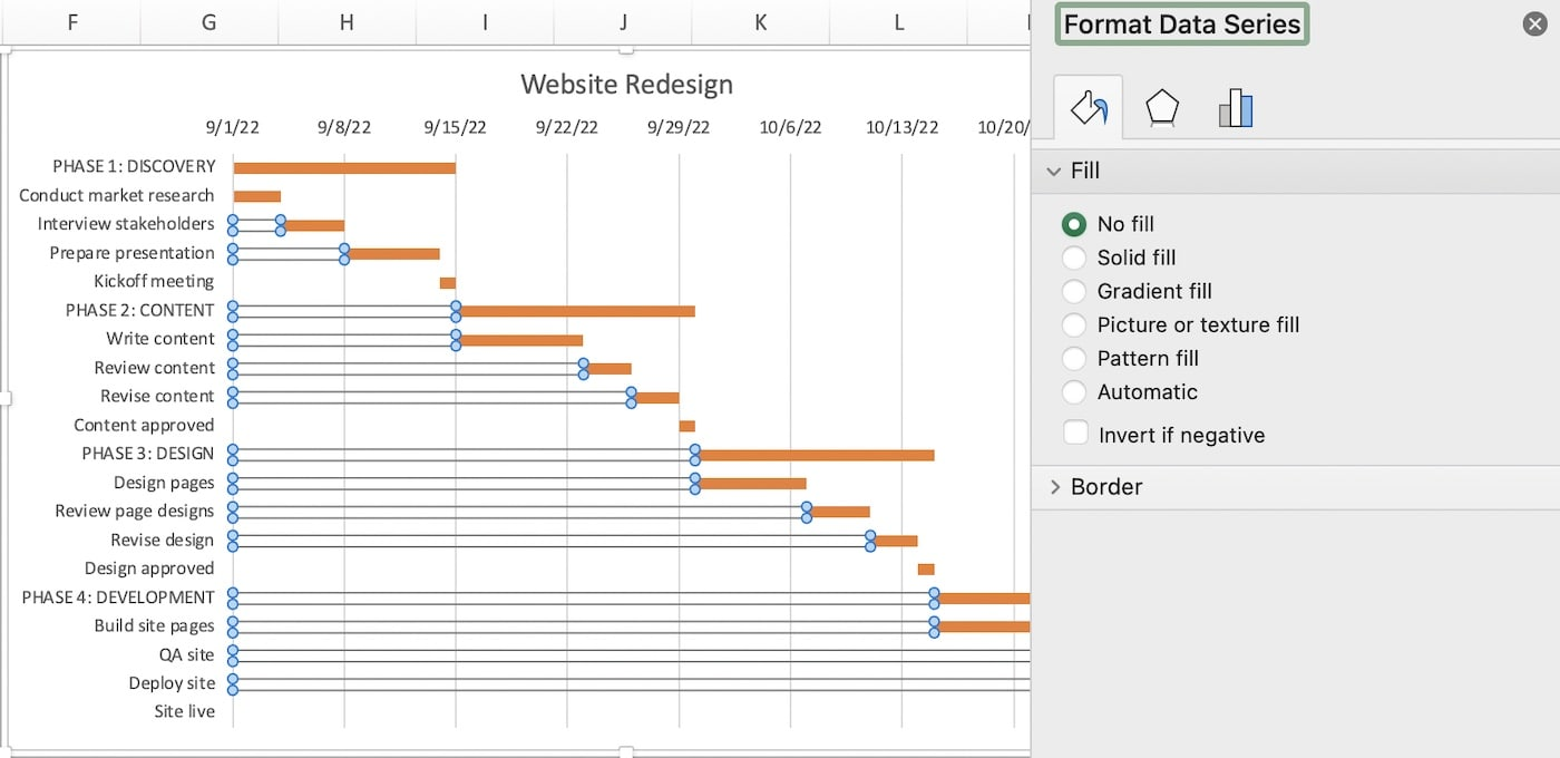
Modify Bar Width and Spacing
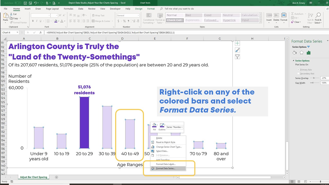
Changes to the bar chart width and spacing enhance Gantt chart readability. Use the Format Data Series option in Excel. Widen the task bars to be more visible from a distance, particularly during large gatherings. Alternatively, more spacing reduces visual noise in densely stacked data sets and makes it easier to identify project tasks .
Label Each Task
It is critical to label each task in a Powerpoint Gantt chart. Each job should be named with a defined amount of time and linked with other activities and resources. Add data labels or custom text boxes to the chart. Keep the text brief and the font size easily readable. With this degree of information, clients can make sense of the job without needing to read the job papers.
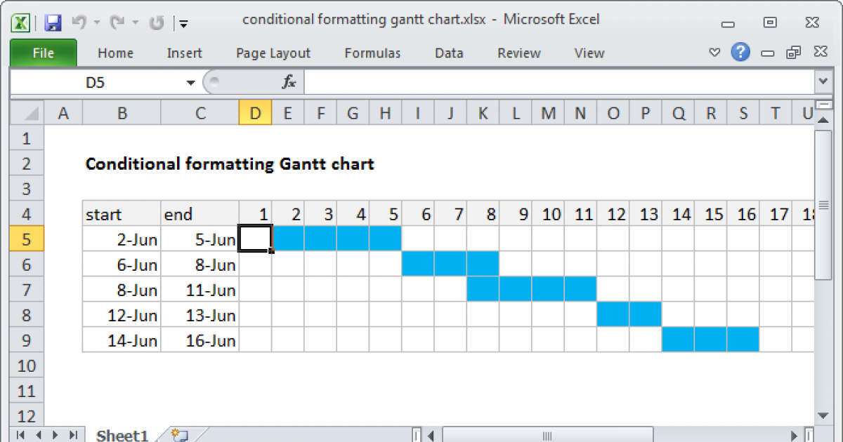
Use Conditional Formatting for Task Status
Excel’s conditional formatting can dynamically update Gantt chart template tasks based on their task grand status. Highlight in red the projects behind their due dates, and green the projects on time. Select the data range to be formatted, navigate to the Home tab, click Conditional Formatting, and select Create Rule to set the rule to track progress or the task to be completed within the fidelity percentage. The visual project timeline difference fosters project tracking and quick depiction of possible problems.
Grid lines and Borders
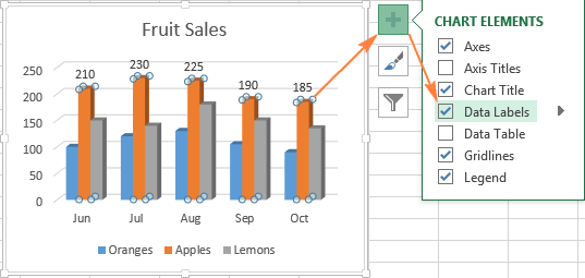
You could benefit from adding grid lines and borders. Grid lines in a Gantt chart stretch the whole plot area from the chart axis to tick indicators. Borders surround chart elements. The two play a vital role in helping to separate information regarding the Gantt chart in an organized way. You can click on chart tools and choose grid lines or borders from the layout tab, ensuring the style and pattern match the Gantt chart. For a complicated project with many tasks and dates, grid lines and borders reduce visual confusion and improve usage.
Adding Advanced elements
As projects expand, your Gantt chart may need more advanced features to handle and present complicated information. To update your chart, learn more about milestones, dependencies, task progress, and automation.
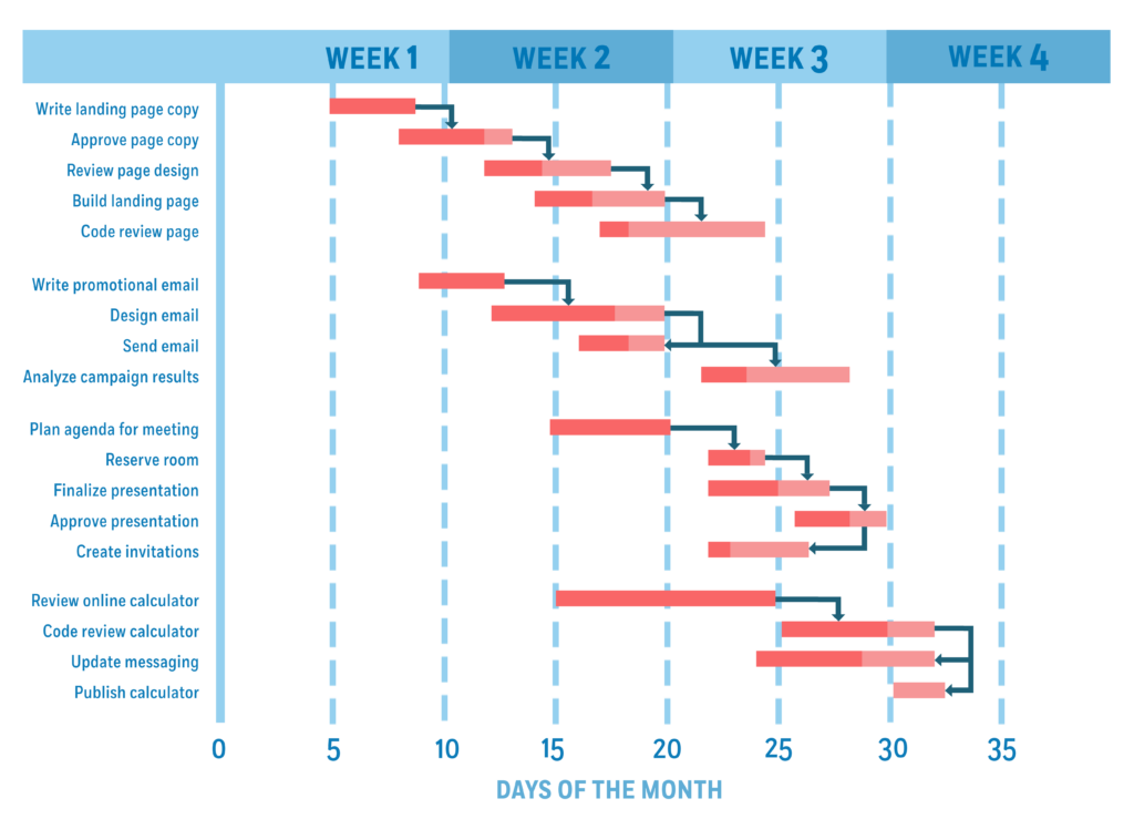
Incorporating Milestones
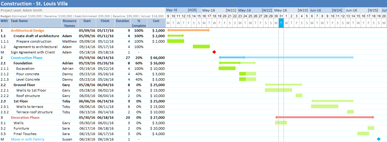
These are markers in a project representing the achievement of a critical phase or goal. They are usually represented by a marker in Excel. Markers help to separate milestones from regular chores, making it clearly visible. You can use shapes, icons, or change the color of the bar chart or line to indicate milestones. Position the markers in the chart to ensure they match the tasks and dates to track progress and achievements. Milestones make the team feel highly motivated by acknowledging significant accomplishments and deadlines.
Simplify project management with Bitrix24!
Organize tasks, track work progress, and collaborate effortlessly – all in one platform. Free forever, unlimited users.
GET BITRIX24 FOR FREEShowing Progress with Partially Filled Task Bars
A Gantt chart can also display dynamic task progress. You can use Excel’s customization capability to represent task progress by customizing the task bars. Overlap a shorter bar on the task bar chart so that you can indicate the finished jobs by color. Add a data series to your chart to illustrate task progress. Make a Gantt chart task bars different colors to clarify what sections of your project are completed against those pending to finish so that you can update these sections frequently to show progress and keep your team open and responsible.
Automating Date Adjustments
Project timeframes frequently change. However, using Excel formulae and functions, you can automate Gantt chart changes based on the dependencies on your tasks, the task duration, and the availability of resources. If one job is over, you can adjust dependent tasks automatically using these formulae. Use Excel’s WORKDAY and DATE functions to create a workday data dependency for tasks. These modifications help keep your Gantt chart up-to-date and reveal the real-time status of your project, reducing the need for manual corrections and errors.
Using Formulas to Calculate Task Durations
Using formulas in Excel allows you to automate the duration calculations for tasks in your Gantt chart. This technique proves useful when the task duration depends on factors like allocated resources or work hours. You can create formulas that determine durations based on input data. For instance, a formula could modify a task's length according to the time and resources assigned to it. Automating duration calculations frees up your time and enhances schedule accuracy. As a result, your Gantt chart templates become more reliable project management tools.
Formatting and Customization
Make your Gantt chart personalized, enhancing its visual appeal to make a Gantt chart visually appealing and more comfortable for your audience to follow project progress and reports. Choose unique fonts and styles; add titles and legends to show your goals clearly and fix errors.
Custom Fonts and Text Styles
The typefaces and text styles of your Gantt chart can make or break its readability and professionalism. Use legible typefaces like Arial or Calibri and maintain constant text styles and sizes across the plan. Use Bold or Italics to highlight deadlines or major projects. Make sure the text color is different from the background for better visibility. This allows the Gantt chart easier to spot, which is particularly beneficial when giving it in a presentation to stakeholders who are not acquainted with the project.
Chart Title and Legends
Gantt charts titles and legends make for effective tools to help visitors decode the visual data. The project title and potentially the Gantt chart period should be shown in the title. Assign a task’s progress, dependencies, or resources using colors and shapes through the legends. This will assist audiences in quickly understanding the plan without having to question anything. Place the title above the title and the legends on the sides or bottom, depending on the type of Gantt chart you are using and how complicated it is.
Error Checking in Task Dates and Durations
Effective project management relies on accurate task scheduling. The Gantt chart operator factors in task dates, durations, and reliability. Regularly verify that the assigned timelines align with the actual requirements. Double-check calculations for errors and ensure dependencies or deadlines are met. Continuous monitoring prevents miscommunication and keeps projects on track. Proper scheduling allows projects to finish on time and within budget. It also upholds the credibility of the project management team.
Applying Custom Colors According to Task Status
Using distinct hues for various task statuses makes the Gantt chart visually appealing and helps track progress straightforward. Designate one color for completed tasks, another for ongoing ones, and a third for those yet to commence. This visual cue enables project managers and team members to effortlessly assess task status without delving into lengthy reports or updates. To dynamically apply these colors based on task status, leverage conditional formatting in Excel. This real-time visual feedback can prove invaluable during project review meetings and stakeholder updates on overall progress.
Integrating with Other Tools
Integrating Excel Gantt charts with other tools can enhance the project management process. Linking Excel with MS project, exporting the chart for sharing, and integrating the data from other project management software are discussed below:
Linking Excel Gantt Charts with MS Project
Microsoft Excel has limited project management features as compared to Microsoft Word Project. By linking the Excel Gantt to Microsoft Word Project, you can leverage the advanced features supported on Microsoft Excel while at the same time using Excel’s familiar interface. Linking the two synchronizes the data across the apps for more comprehensive project management.
Exporting Gantt Charts to PDF or Image Formats
Sometimes, you should share your Gantt chart with stakeholders who don't use Excel or need a static format for reports or presentations. Excel may export your Gantt chart to PDF or picture formats for viewing on any device without Excel. Communicating project timeline and statuses externally or to individuals without access to the project's working files requires this feature.
Importing Data from Other Project Management Tools
Import data from Trello or Asana into your Excel Gantt chart. This connection ensures project management accuracy and consistency. Depending on its complexity and format, data can be imported manually or through data links.
Integrating Bitrix24 into Project Management
Use Bitrix24 to improve project management chart and find reliable Gantt chart helps. Bitrix24 offers powerful project tracking, collaboration, and CRM capabilities. By integrating Bitrix24, you can manage projects more effectively through real-time updates and automated workflows, which are essential for large teams and complex projects.
Tips and Tricks
These strategies purposely target an Excel Gantt chart. Keyboard shortcuts, models, and other computer methods for big Gantt charts are discussed. Excel Computer techniques
Keyboard Shortcuts for Faster Chart Management
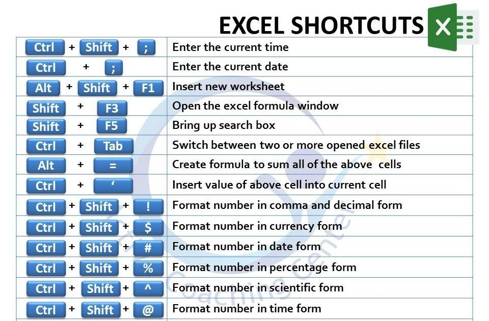
Computer shortcuts in Excel may be employed to manage Gantt charts. For example, quickly copy and paste information, add worksheets, and align units. Because of these methods, you may devote more time to project research and decision-making and less time to chores.
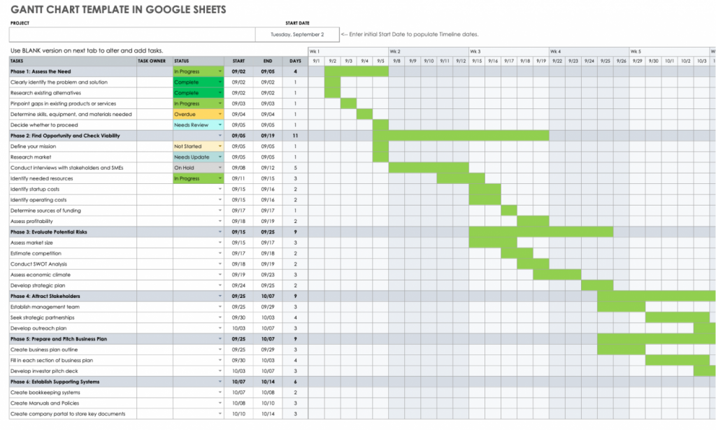
Using Gantt chart template to Speed Up Creation
Gantt charts in Excel may look at various models. These Gantt chart template options frequently have pre-set grades and estimations, which make them easier and quicker to build. Gantt chart template models may be customized for whatever enterprise, you need to get started on it faster to maintain complex.
Best Practices for Maintaining Large Gantt Charts
Gantt charts of certain sizes regularly require repair and variations. Development designs, data integration, and validation, Gantt chart template, and project development evaluations must be scheduled regularly with stakeholders. These methods may guarantee that you do not control data plainly or misleadingly and make crucial errors.
Conclusion
Gantt chart is needed to be precisely designed, updated, and regulated to satisfy the demands of project management. Set up an overseeing data method and utilize it to make a Gantt chart in Excel from the starting to seeing the correct data and replying to additional tools. Develop a stable relationship to advise project improvement, deploy business strategies, and make the correct judgments.
: Steps, Stages & Tools That Boost Conversions")

